
The Ultimate Guide to Responsive Web Design
Hello! I'm Bree, a seasoned Squarespace designer with seven years of web design experience. I lead Studio La Terre, an agency that specializes in crafting responsive web designs paired with robust SEO strategies to elevate user engagement and conversion rates. This ultimate guide will delve into the principles of responsive web design, why it's crucial for modern websites, and how we, at Studio La Terre, ensure our designs not only look great but also perform exceptionally across all devices.

What is Responsive Web Design?
Responsive web design is an approach to web development where the layout and content of a website adjust smoothly to fit various screen sizes and devices. This technique ensures that users have a seamless and optimal viewing experience, whether they’re on a desktop, tablet, or smartphone.
Key Components of Responsive Web Design
Fluid Grids: Instead of using fixed-width layouts, fluid grids allow page elements to resize proportionally based on the screen size.
Flexible Images: Images are scaled within their containing elements, ensuring they adjust correctly across different devices.
Media Queries: CSS3 media queries enable different styles to be applied depending on the device's characteristics, such as screen width, height, and orientation.

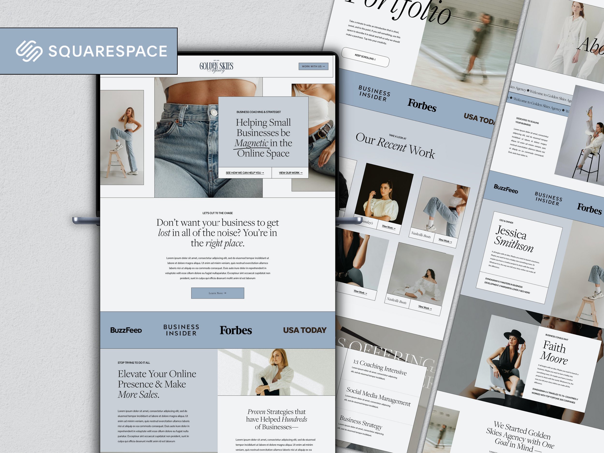
Studio Aster Squarespace Template by Studio La Terre
Why Responsive Web Design Matters
Improved User Experience
A responsive website provides a consistent user experience across all devices. Visitors can navigate easily, regardless of the device they use, which reduces bounce rates and increases engagement.
Enhanced SEO Performance
Google prioritizes mobile-friendly websites in its search rankings. A responsive design ensures your site meets Google’s mobile-first indexing criteria, boosting your SEO efforts.
Increased Reach
With a growing number of users accessing the internet via mobile devices, a responsive website helps you reach a wider audience. It caters to users on-the-go, making your content accessible anytime, anywhere.
Cost-Effective Maintenance
Managing a single responsive site is more cost-effective and easier than maintaining separate websites for desktop and mobile users. Updates and changes need to be made only once, saving time and resources.

Studio Aster Squarespace Template by Studio La Terre
Principles of Responsive Web Design
Mobile-First Approach
Starting the design process with mobile devices in mind ensures that your website is built to perform well on smaller screens before scaling up to larger ones. This approach often results in a cleaner, more focused design.
Prioritize Content
Content prioritization is crucial. Key information should be easily accessible, with less important details available but not obstructive. This hierarchy ensures users find what they need quickly and efficiently.
Flexible Layouts
Design layouts should adapt to various screen sizes. Using percentages and relative units instead of fixed dimensions allows elements to resize appropriately.
Scalable Vector Graphics (SVGs)
SVGs are resolution-independent, ensuring your images look sharp on all devices, from small phones to large monitors.
Touch-Friendly Design
Interactive elements, such as buttons and links, should be large enough and spaced appropriately to be easily tappable on touch screens. This enhances usability on mobile devices.

How Studio La Terre Implements Responsive Web Design
Comprehensive Research and Planning
At Studio La Terre, our process begins with thorough research. We analyze your target audience, their device preferences, and their behavior patterns. This data informs our design decisions, ensuring the final product meets user needs.
Customizable Squarespace Templates
While Squarespace offers excellent built-in responsiveness, we take it a step further by customizing templates to fit your brand and functional requirements. Our designs are not only visually appealing but also tailored to deliver the best performance across all devices.
Integration with SEO Strategies
Responsive design and SEO go hand in hand. Our team integrates SEO best practices into every aspect of the design process. From clean, semantic HTML to optimized images and fast loading times, we ensure your site is primed for search engines.
Continuous Testing and Optimization
We conduct rigorous testing across multiple devices and browsers to identify and fix any issues. Post-launch, we monitor performance and make necessary adjustments to ensure ongoing optimal functionality.

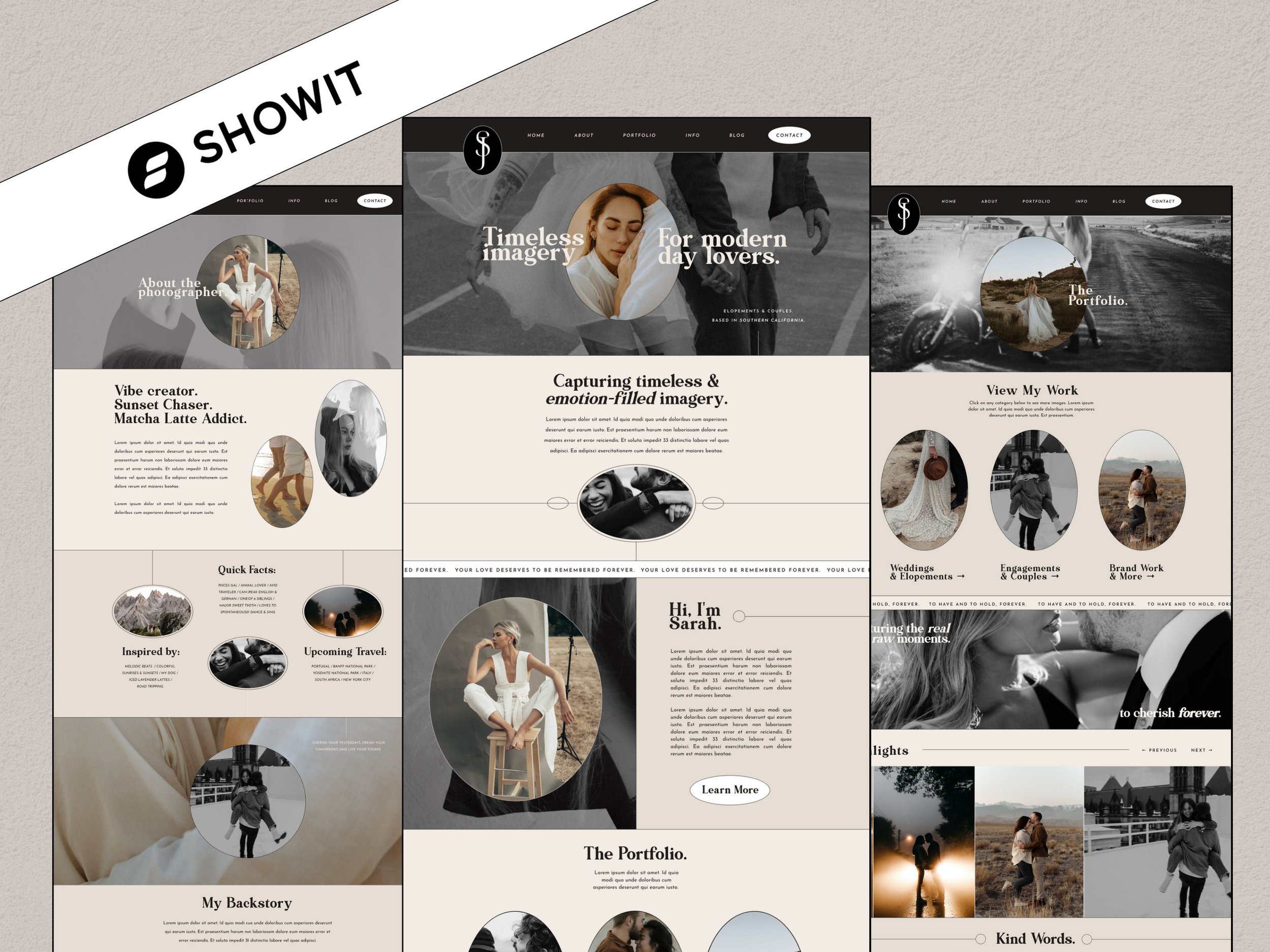
Customer Examples of Squarespace Templates by Studio La Terre
Checklist for Implementing Responsive Web Design
Here’s a detailed checklist to guide you through implementing responsive web design:
Research and Planning
Analyze target audience and device usage.
Define primary goals and user tasks.
Create a content hierarchy and wireframes.
Design and Development
Use a mobile-first approach.
Implement fluid grids and flexible layouts.
Optimize images using responsive techniques.
Utilize media queries for breakpoints.
Ensure touch-friendly design elements.
SEO Integration
Perform keyword research often.
Optimize page loading speed.
Implement proper meta tags and descriptions.
Use structured data for enhanced search visibility.
Testing and Optimization
Test across multiple devices and browsers.
Validate HTML and CSS.
Check for accessibility compliance.
Monitor site performance post-launch.

Studio Aster Squarespace Template by Studio La Terre
Common Challenges and Solutions in Responsive Web Design
Challenge 1: Complex Navigation on Small Screens
Solution: Implement hamburger menus or collapsible sections to simplify navigation on smaller devices without sacrificing functionality.
Challenge 2: High-Resolution Images Slowing Down the Site
Solution: Use responsive image techniques, such as srcset and picture elements, to serve appropriately sized images based on the user's device and screen resolution.
Challenge 3: Maintaining Consistent Branding Across Devices
Solution: Ensure design elements like fonts, colors, and logos are scalable and adaptable. Use relative units and flexible design principles to maintain a consistent look and feel.

Studio Aster Squarespace Template by Studio La Terre
Future of Responsive Web Design
Progressive Web Apps (PWAs)
PWAs combine the best of web and mobile apps, offering a responsive, fast, and reliable user experience. They are becoming increasingly popular as they work offline, load quickly, and provide a native app-like experience.
Advanced CSS Techniques
New CSS properties and techniques, such as CSS Grid and Flexbox, offer greater control over layout and design, making it easier to create responsive designs that look great on any device.
Voice User Interfaces (VUIs)
With the rise of voice-activated devices, designing for VUIs will become an integral part of responsive web design. Ensuring your website is accessible and functional through voice commands will enhance the user experience further.

Conclusion
Responsive web design is no longer optional—it's a necessity in today’s digital landscape. As a Squarespace designer with extensive experience, I’ve seen firsthand how a well-executed responsive design can transform a business’s online presence. At Studio La Terre, we specialize in creating responsive websites that not only look stunning but also perform exceptionally well, thanks to our integrated SEO strategies.
By following the principles and best practices outlined in this guide, you can ensure your website provides an optimal user experience across all devices, helping you reach a broader audience and achieve your business goals. Whether you’re starting from scratch or looking to revamp your existing site, remember that responsive design is the key to a successful and future-proof online presence.