
Color Palette Inspiration for Designers: 5 Timeless Directions to Elevate Your Brand
1/15/26
Color is one of the fastest ways to communicate emotion, positioning, and value. The right palette doesn’t just make a website look good — it tells visitors who the brand is for before they read a single word.
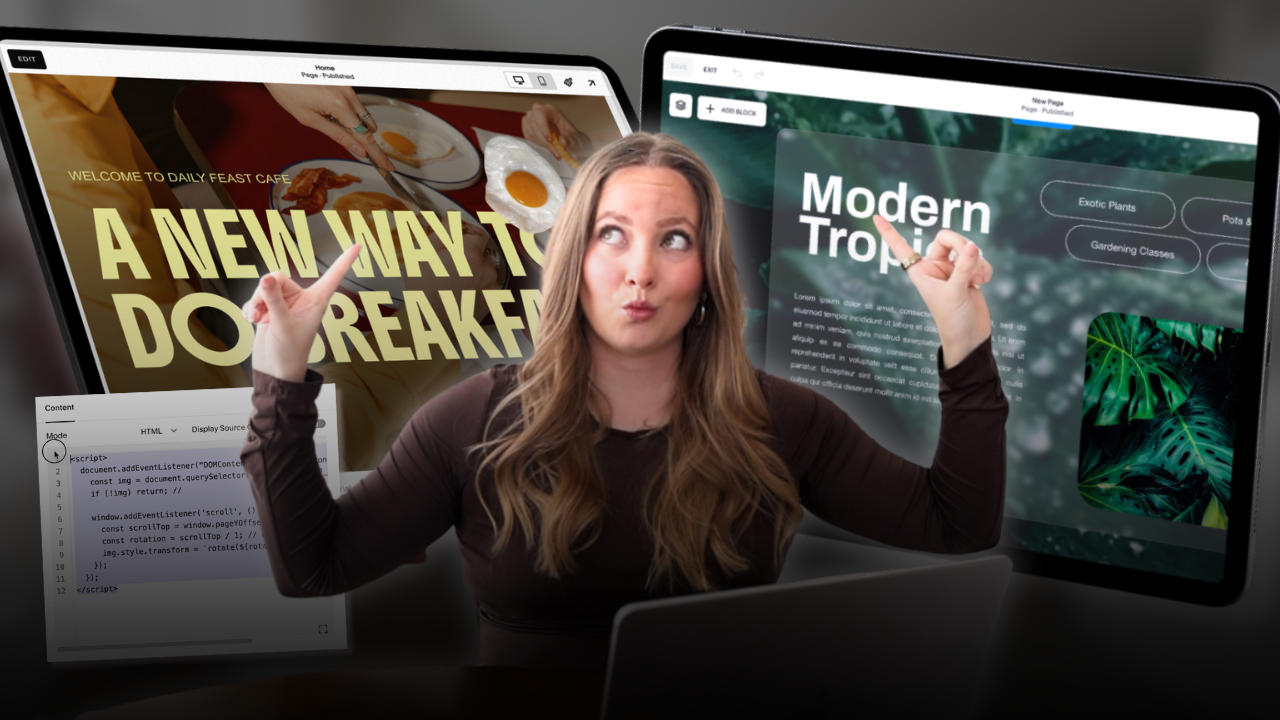
Below, we’re breaking down five curated color palette directions inspired by real-world textures, materials, and moods. These palettes are especially well-suited for Showit and Squarespace websites, where strong visual identity and storytelling matter.
1. Moody Reds & Deep Neutrals
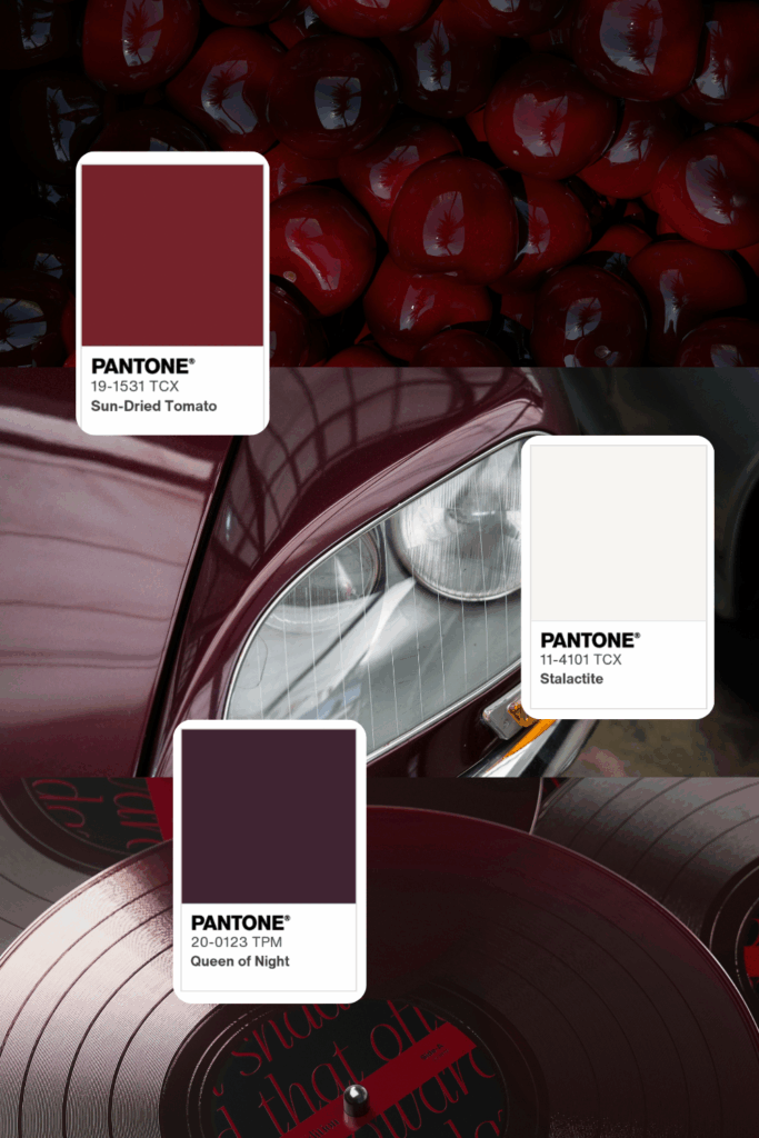
Sun-Dried Tomato · Queen of Night · Stalactite
This palette is rich, dramatic, and editorial. The deep wine red paired with near-black plum tones creates a sense of luxury and intrigue, while the soft off-white keeps it grounded and usable for web.
Best for:
- Luxury brands
- Fashion designers & stylists
- Creative studios
- Editorial-style portfolios
- High-end product launches
Why it works:
These tones feel confident and intentional — perfect for brands that want to feel established, bold, and slightly unconventional. On websites, this palette shines when used with large typography, high-contrast layouts, and minimal accent colors.
Design tip:
Use the deep red sparingly as an accent (buttons, hover states, or headings) and let darker neutrals dominate backgrounds for a polished, high-fashion feel.
2. Warm Coffee & Cream Neutrals
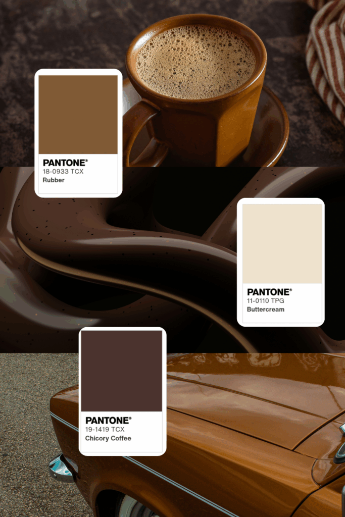
Rubber · Chicory Coffee · Buttercream
Warm, comforting, and familiar — this palette feels like slow mornings and thoughtful craftsmanship. The rich browns paired with soft cream tones create an inviting, grounded aesthetic that works beautifully across digital templates.
Best for:
- Lifestyle brands
- Coaches & consultants
- Wellness businesses
- Interior designers
- Food & beverage brands
Why it works:
Neutral doesn’t have to mean boring. These tones add warmth and depth without overpowering content, making them ideal for text-heavy websites, storytelling sections, and service-based brands.
Design tip:
Pair this palette with organic photography, subtle textures, and serif typography for a timeless, elevated look — especially effective in Showit templates that rely on strong visual flow.
3. Earthy Greens & Organic Depth
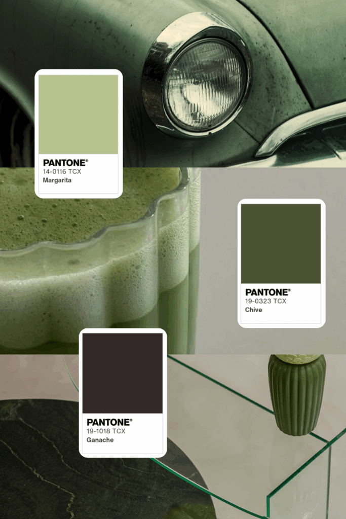
Margarita · Chive · Ganache
This palette feels natural, intentional, and quietly sophisticated. Muted greens paired with deep charcoal-brown create a balance of freshness and grounding — perfect for brands rooted in sustainability or wellness.
Best for:
- Eco-conscious brands
- Wellness & skincare
- Holistic practitioners
- Boutiques & artisan brands
- Modern lifestyle bloggers
Why it works:
Green tones signal growth, calm, and trust, while darker neutrals keep the palette from feeling overly soft or juvenile. It’s especially effective for brands that want to feel modern yet connected to nature.
Design tip:
Use lighter green tones for backgrounds or section breaks, and reserve darker shades for navigation, footers, or typography to maintain contrast and readability.
4. Pastel Yellow · Strawberry Cream · Pastel Blue
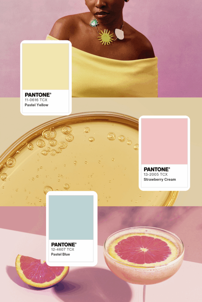
This palette is soft, playful, and sunlit. Creamy yellow and blush pink bring warmth and approachability, while the airy pastel blue adds balance and freshness, keeping the palette from feeling overly sweet.
Best for:
- Wellness & skincare brands
- Lifestyle bloggers & influencers
- Beauty, fashion, or accessory brands
- Creative entrepreneurs
- Feminine, modern personal brands
Why it works:
These colors feel optimistic and inviting — perfect for brands that want to feel joyful, human, and modern. The warmth of yellow and pink creates emotional connection, while the cool blue introduces calm and clarity, making it highly usable for web and digital products.
Design tip:
Use Pastel Yellow as the primary background or hero-section color, Strawberry Cream for accents (buttons, highlights, badges), and Pastel Blue for secondary sections or supporting UI elements to maintain visual balance without overwhelming the design.
5. Bellwether Blue · Cloud Dancer · Lapis Blue
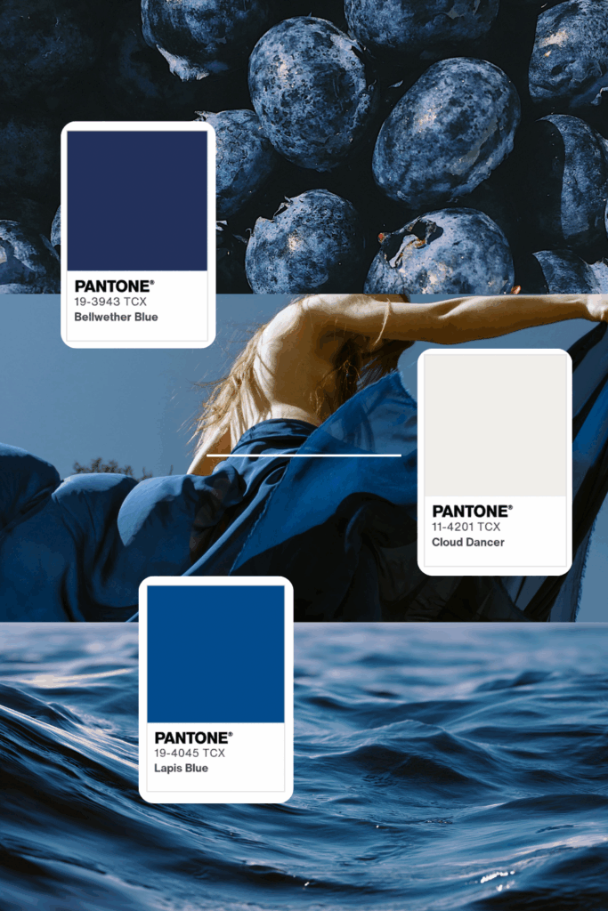
This palette is calm, refined, and quietly powerful. Deep navy and saturated ocean blue ground the palette with confidence and depth, while the soft off-white adds airiness and balance, keeping it elegant rather than heavy.
Best for:
- Editorial & magazine-style brands
- Luxury wellness or retreat brands
- Fashion designers & photographers
- Creative studios with a minimal aesthetic
- Coastal, travel, or lifestyle brands
Why it works:
These tones feel timeless and composed — ideal for brands that want to project trust, sophistication, and emotional depth. The contrast between dark blues and a gentle neutral creates visual hierarchy without relying on loud colors, making it especially effective for long-form content and storytelling websites.
Design tip:
Use Bellwether Blue or Lapis Blue for backgrounds, navigation, or large image overlays, and reserve Cloud Dancer for typography, spacing, and negative space. This keeps the design feeling light, editorial, and highly readable while still impactful.